Once Upon a Time, Inc.
Landing Page and UX Writing

Role
UX Writing Co-Lead
Timeline
4 months
Tools
Figma, Figjam, Notion
Once Upon a Time in Queens… 🌃
Background
Once Upon a Time Inc., was a thriving theatre school in Queens since 1980. After the school’s founders passed in 2020, the school’s future was uncertain until dedicated alumni took over.
Now, they need a new, modern website that honors the past and gets the community excited for the next steps.
Research
I was brought onto the Once Upon a Time, Inc. team in conjunction with the nonprofit, Techfleet, as a UX writing co-lead. My co-lead and I interviewed brought on four apprentices who displayed superior leadership skills and willingness to learn, make mistakes, and work as part of a team. Along with a writing team, the first phase of this project included a strategy and research team.
With all the teams set, we received the first set of goals from the client for our first agile sprint.

But wait!
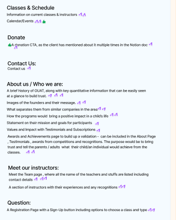
Before taking on these tasks, there were a few steps I encouraged the team to complete. I always say good writing is half research and building a solid foundation of research will help make the building of the actual content much easier.
I set up and started a competitive analysis with fields that focused on the navigation elements of direct and indirect competitors as well as their writing style and tone. I also set up a site audit which I quickly realized was not needed as it was under construction.

Competitive Analysis

Writing Style Guide
I also set up a writing style guide that would act as a reference for the team.
Since the research team had not yet gotten results from their initial poll, we gathered findings from the competitive analysis and inspected the client’s social media pages to make some initial assumptions about the user and their needs.
The team and I agreed that this would be a living document that would evolve and be regularly audited, ideally once a month during the first year, to reflect new findings from the research team and client. An in-depth case study on the writing style guide will be published May 2025 on my portfolio.
Version 1 of the Writing Style Guide
November/December Sprints - Writing Site Content
After this initial research, the team volunteered for tasks they were interested in from creating information architecture for the navigation to longer content on the ‘about us’ page.
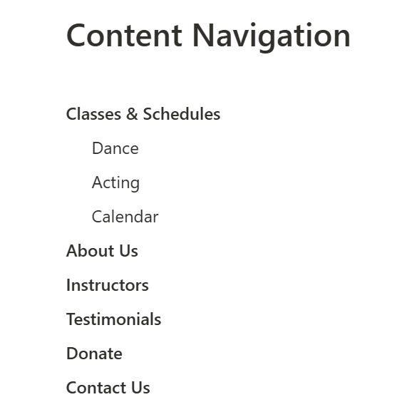
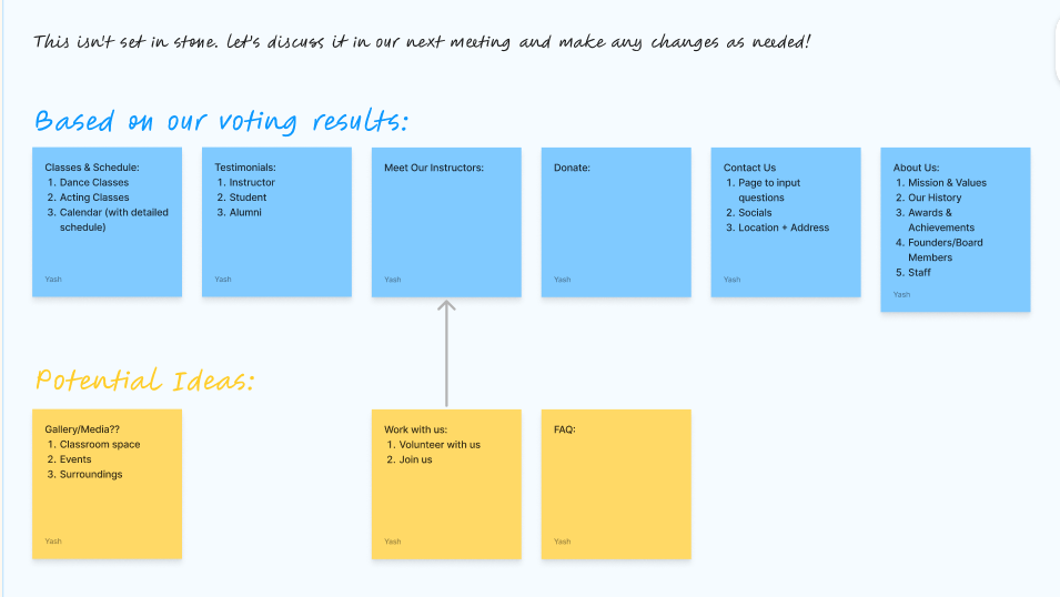
We had a meeting before separating out tasks in which we focused on navigation, submited categories we associated with a theatre school, and voted on the most important navigation elements. Afterwards, an apprentice created the first proposed navigation based on the voting results.
The preliminary navigation items the team submitted and then voted on.
The final proposed navigation I edited.
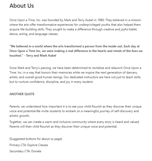
2 apprentices took on the task of writing a short about us page with a welcoming, inspiring, and community-focused tone as per the client’s request. The team also discussed addressing the two likely users to the theatre school: parents and their children.
The apprentices were able to find a quote from the founders on their social media channels which was a great way to tie in the original spirit of Once Upon a Time, Inc.
The first draft of the about us page completed by 2 apprentices.
I loved the quote from the founders, so when I edited the page for the client I made sure to include another section with a quote to really solidify that connection to the founders and provide a visual sepration between paragraphs that would aid in scanability.
I noticed there were a few idioms in the original version that I edited since the team and I found statistics that Queens is an incredibly diverse area with many residents whose primary language is not English. By reducing idioms and metaphors, I wanted to make the page as accessible as possible for users.
The original proposed navigation completed by an apprentice.
I edited the final header navigation with the main goals to lessen user cognitive load and be easily scannable. I condensed the original proposed navigation to highlight the most high-priority categories, such as the donate and testimonials section the client requested.
I added instructions into the phase 2 handoff notes to perform a tree test with at least 5 users and to reference the original proposed navigation in case they determined through testing that more pages would aid user navigation.

The final About Us page edited by me for client approval.
January Sprints - Upskilling & Microcopy Brainstorming
At the start of the new year, our team faced a new challenge. The client had to perform urgent renovations at the school’s building and would not be available during January and part of February. Since we had no backlogged writing goals, I met with the apprentices one-on-one for ideas.
I discovered through these check-ins that team members weren’t familiar with UX writing conventions and wanted to learn more but didn’t know where to start.
I transformed our weekly meetings into UX content crash courses that touched on topics the team was most interested in. A poll after the first session revealed that the team found these sessions extremely helpful and wanted to continue with them in between sprints.
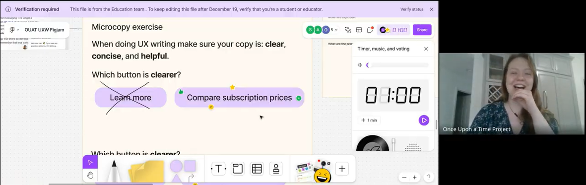
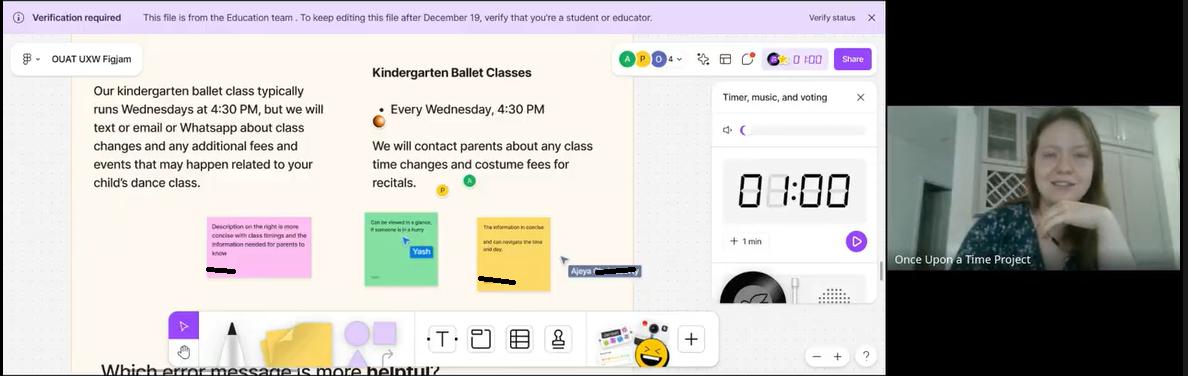
In conjunction with the UX writing lessons, the team and I spent 2 weeks focusing on button copy which the client had expressed interest in early on. With the fundamentals covered, apprentices had a solid base for how to formulate microcopy to align with user expectations and UX standards.
I catalogued all the potential actions, sign ups, and confirmation messages that could occur on the site and sent out a Google form to the team to submit multiple ideas for button copy. We later voted on our top 1 or 3 choices that we could A/B test in the future with users.

February/March Sprints - Project Scope Pivot & Landing Page Creation
Before our final sprint, the client sent us an email that the scope of the project had changed. Instead of a theatre school, the board reenvisioned the space as a community center.
Additionally, they wanted to know if we could write and design a brand-new landing page in one week. Were we up to the task? I saw each team member’s skills and dedication and had no question we could come together and do it.
The client requested we submit 2 or 3 versions of introductory text for the landing page that would address the 3 points below and be edited based on client feedback.

The first version was written by me and the second by my co-lead. I had these goals in mind with my writing:
Suggest header sizes and buttons/actions for the users to get a better idea of how the intro may look on the landing page.
Include the location and name of the company prominently for user scannability and SEO purposes.
Tie in the name of the organization in a playful way that won’t be confusing to those with limited English.
Speak in a positive tone that gets the community excited for next steps.
The client decided on the second version with the request that “despite the loss” be removed due to its gloomy tone. It was edited to say “although our founders have passed…” instead.
Drafting the Landing Page
A subcommittee was created to design a landing page with me in charge of ensuring the writing and content sections aligned with client goals and UX standards.
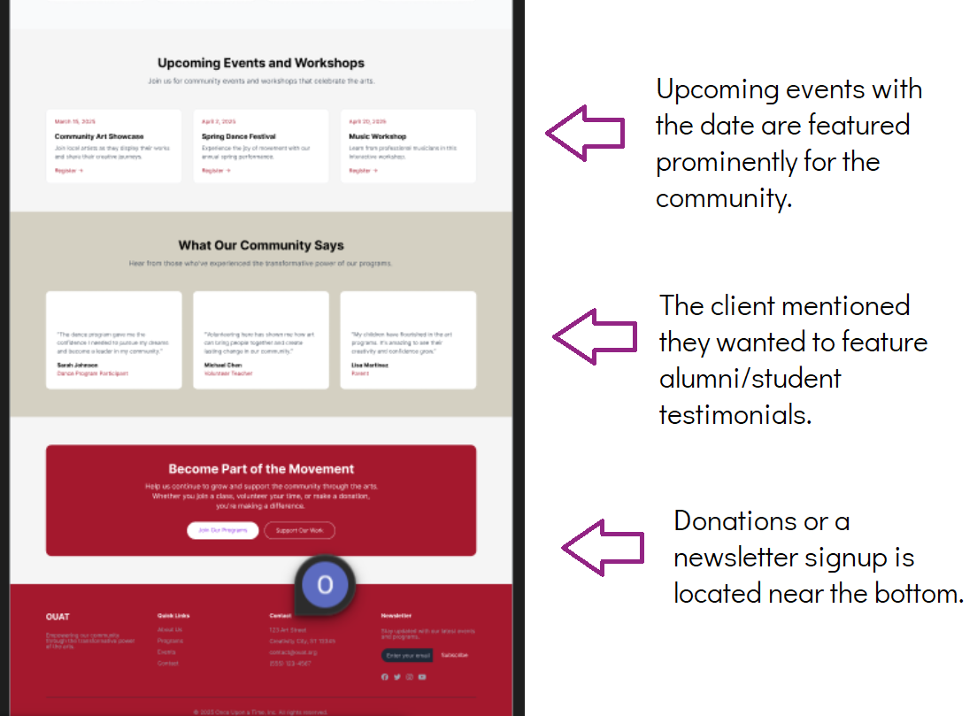
We discussed featuring the location and types of classes toward the top of the page. The research team was still gathering insights so our team assumed most users would be on the site to sign up for classes. For users who like to read more, testimonials and local events were featured a bit lower on the page.
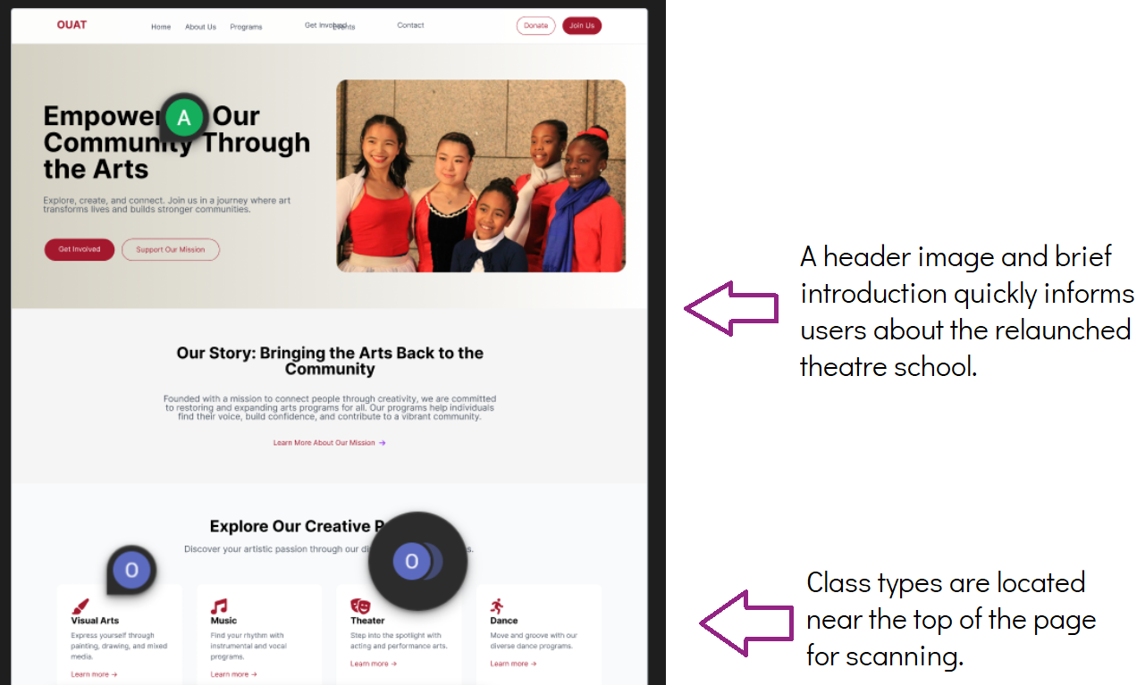
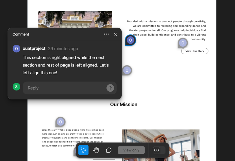
I reviewed the first draft and left comments on Figma with feedback related to content structure, design, and written copy.

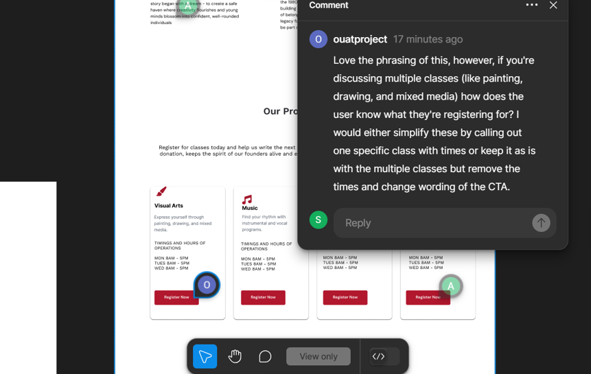
The team ultimately wasn’t able to get unanimous approval from the leads in time for the end of phase 1 and the handoff notes subsequently were updated to finish the landing page at the beginning of phase 2.
Regardless, we were able to meet with the client for a final demo of all work and they were incredibly pleased with where everything was headed.
Takeaways & The Future of Once Upon a Time 🔮
Taking on the role of a co-lead was intimidating at first, and while this was a huge challenge to take on, I learned a lot and felt the experience was very rewarding. I was able to improve my own UX writing skills and reinforce UX content standards through teaching the apprentices.
Although it’s unfortunate the landing page didn’t go live during this phase, it’s an important reminder to always be flexible and, as cliche as it sounds, to expect the unexpected!
These are the suggested goals I put in the handoff notes for phase 2 :
Start getting client feedback on copy and style guide sections to see what’s resonating with them and what needs to change.
Continue to build out the style guide as the project goes on based on research contributions and client feedback.
Begin A/B testing microcopy with users.